My old BucketSoft site was simply a place where I could show off the products I've built under the BucketSoft name. But as I'm taking on new clients and doing more web performance work the site was in need of an overhaul to reflect my new mission.
The Requirements
- It must be fast, of course.
- It can be simple but it should be rich enough to be pleasing with nice web fonts and icons.
- It must look good everywhere: phone, tablet, and desktop. But it must be especially fast on a phone.
For every site I design, my very first step is to start with Balsamiq Mockups. This one was no different...
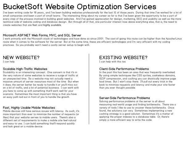
It doesn't look like much. The goal is to just focus on basic content and layout at this stage, and not get too carried away. Balsamiq Mockups is meant to be a low-fi tool and that's exactly how I use it.
The first attempt in Photoshop
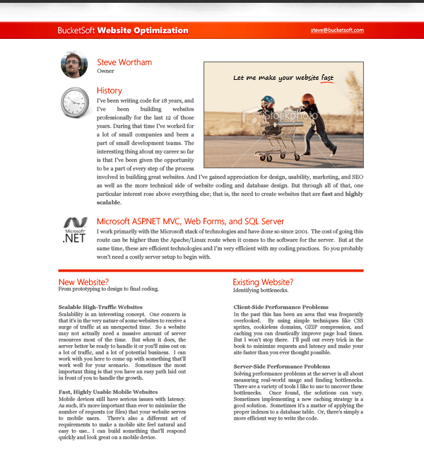
I love the photo and the tagline, "Let me make your website fast". I'm also pretty happy with the color scheme at this stage. But the layout isn't really working for me and the icons I'm using lack consistency.
The second attempt in Photoshop
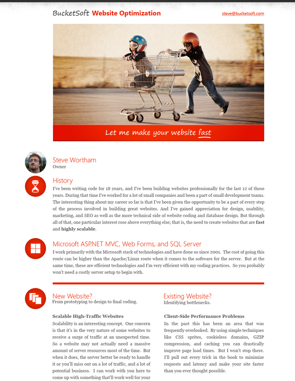
Now we're getting there. The text justification is consistent all the way down the page like you might see in a magazine. And the icons along the left hand side have a consistent look to them. Since the photo of the kids and the shopping cart is so great, I've made it much bigger. I've also applied a darkened corner effect to the photo like the Top Gear TV show likes to do, and I've given the photo a grainy look to match the grainy texture on the top of the page.
I made a few tweaks even after this, but not much. This was pretty much what I wanted.
Responsive Design and Optimization
At this point I began cutting images, creating CSS sprites, writing code, and designing my stylesheet. One of the most important parts of optimizing a site is to reduce the number of requests as much as possible. So I'm strategic in the way I create my CSS sprites. Not only do I want to reduce the number of images the client's browser has to download, but I also don't want mobile devices to download images that they aren't even going to display.
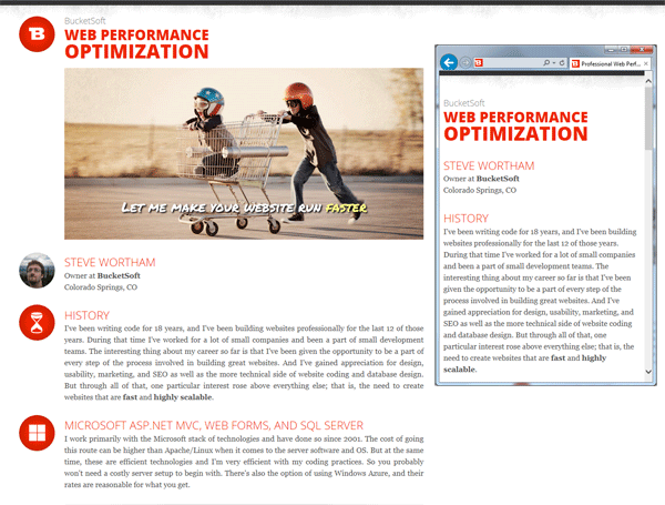
And there we have it. The site is configured to hide the large photo and icons on mobile displays. And these images won't even be downloaded on mobile devices. They are 69 KB and 12 KB respectively, so this is substantial savings.
Final Optimizations
- Set up a CDN for all the images and my CSS file. I like to use MaxCDN.
- Set a far-future (1 year) expiration date for all static files.
- Make sure GZIP is enabled in IIS.
Performance Verdict
According to webpagetest.org the homepage will load in 1.5 seconds over DSL. And there are 10 requests totalling 163 KB.
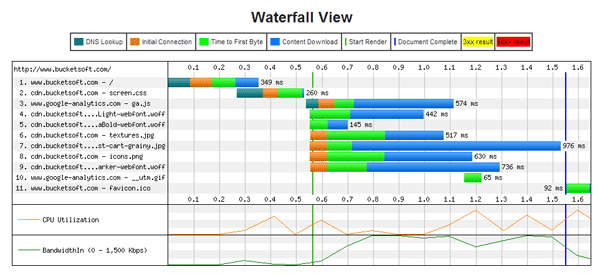
On a mobile device it's even better with 8 requests totalling just 82 KB. This is far better than average by today's standards.